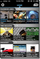
 Pulse is a news reader that aggregates feeds from various sources using RSS and presents them in a good looking interface. I’ve been using RSS Readers for a while and at a first glance Pulse seemed like a great leg up from the existing apps like Reeder or Byline, it feels like you’re using a proper app with all the goodies of immersive experience instead of a web browser wrapped in an app. Steve Jobs showed off the iPad version of the app in his keynote and there have been lots and lots and lots of rave reviews about the app so I won’t go into those details but focus on the pricking points instead.
The key differentiator is the problem
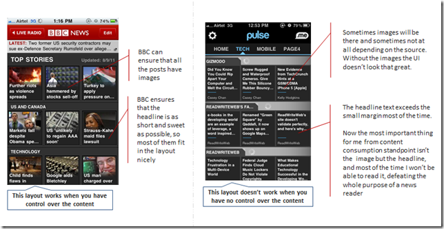
This is a classic example of how not to design for multiple devices. This interface was designed for iPad and it worked great there, but the problem started when the exact same UI was scaled down for the iPhone. Now when you start off it’s all hunky dory, but when the novelty wears off and reality sets in, you realize that it’s not that usable. Here’s a comparison between BBC, which has a layout similar to Pulse.
Now I understand the need to stand out and be unique, but that can’t come at cost of basic usability. As described above, this layout works for BBC because it has control over it’s content but won’t work for someone who sources their content from independent feeds and has no control over their content.
If Pulse wants to build a mass base, they need to address the usability issues which can become a problem in the long run.
Suggestion
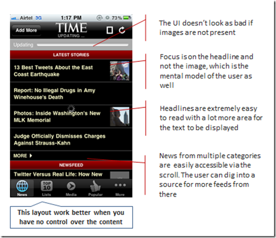
I suggest that Pulse team considers something on the lines of TIME layout which suits their content type better.
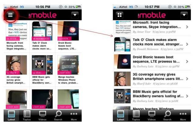
The least they could do is give the user a choice to shift from list view to grid view as done by the Engadget app


I don’t think the problem is the content. I think the basic problem is that each tile is too short in width.
They should simply make tabs, and allow each article to take full width within each tab. Or if they do not want tabs, then just increase the width of each tile so it consumes 80% of the screen.
I agree, problem is not with the content but the presentation. In fact I suggested the second comment you made, TIME is a perfect example of how this type of content can be managed
Pingback: Quora
Pingback: MEX – the strategy forum for mobile user experience – Scaling across screens
You’re sure making a lot of assumptions on the users mental models. I realize you’re doing a mini-heuristic but you really need to substaniate your views with research or at least indicate that this is your opinion. This is a huge problem with our industry and this blog post is a perfect example. With all due respect,
Bruce
Bruce,
I understand your viewpoint, but you can relax about this particular review. I have a lot of experience in creating information oriented mobile UI, the reference to user’s mental model is coming from studies conducted for various such user interfaces
Pingback: Carnival of the Mobilists #252 | Wap Review
Pingback: Carnival of the Mobilists #252 | Technology, Mobility, Usability and other Musings
Pingback: 10 Design Multiple Sites | Museum Designs